
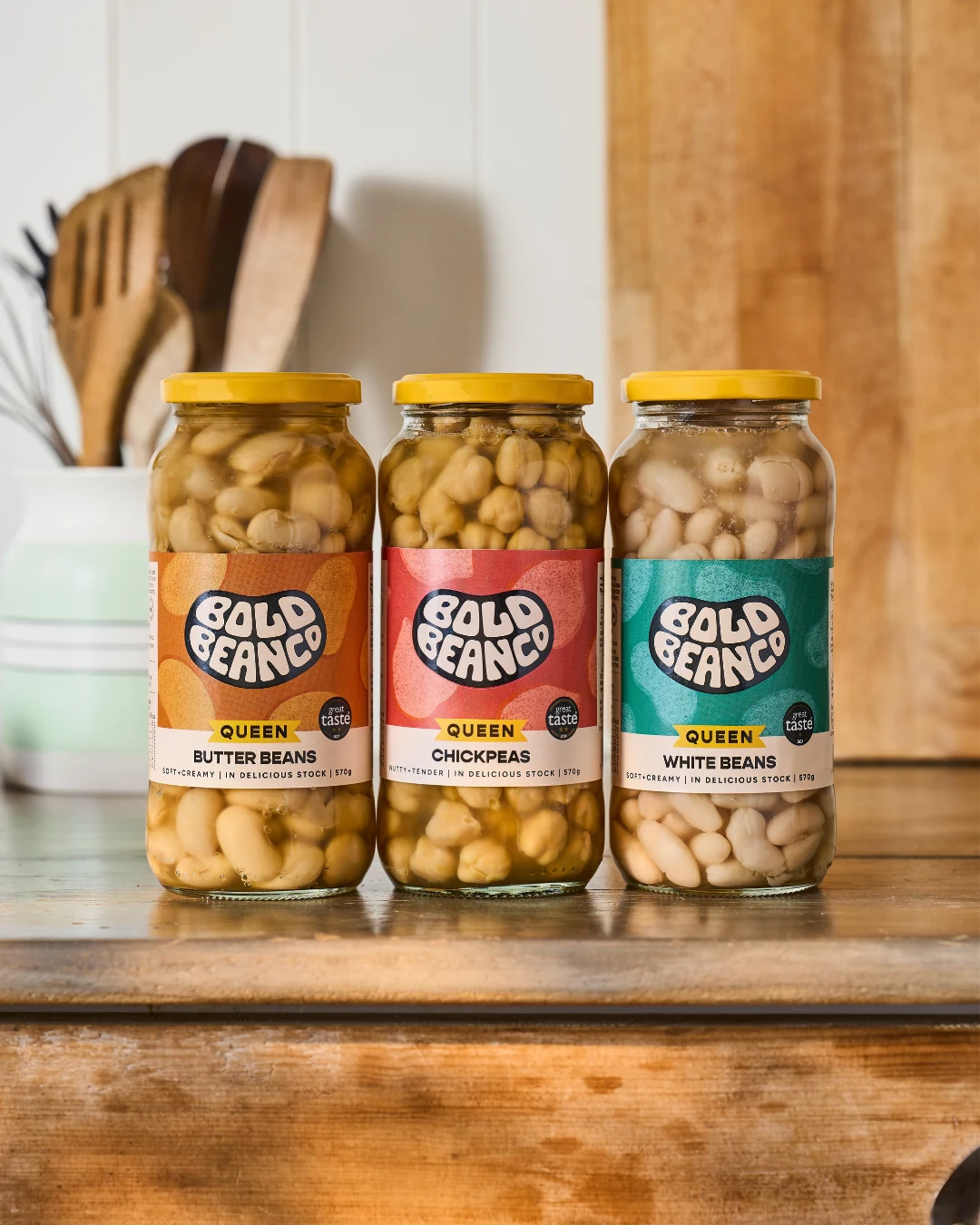
I saw the new packaging from Bold Bean this week and my first thought was pretty simple: they've made beans look tastier.
That might sound flippant, but it's actually quite a difficult thing to achieve. Beans aren't new, obviously; they're cheap, nutritious, widely available and have spent decades sitting in supermarket aisles in fairly anonymous tins. You can walk into pretty much any supermarket and buy kidney beans, chickpeas or butter beans for not very much money, so how do you persuade someone to walk past those and pay considerably more for a jar?
That's where branding gets interesting.
You're not always selling something unique
There's a tendency in branding to obsess about uniqueness. What's your USP? What's the thing nobody else can possibly say? What makes your product completely different from everything else on the market?
Sometimes the uncomfortable answer is: not that much.
There might be genuine differences in quality, provenance, ingredients, process or taste, and in Bold Bean's case the product itself gives them plenty to talk about. But consumers aren't standing in a supermarket conducting a forensic investigation into the provenance of six different butter beans; they're looking at a shelf and making a series of remarkably quick judgements about what looks good, what they understand, whether it feels relevant to them and whether it's worth the money.
And, fairly importantly when you're selling food, whether they actually want to eat it.
You can have a beautifully designed pack that wins awards and looks fantastic on a designer's Instagram feed, but if it doesn't make the food inside look appealing, you've arguably missed the most important part of the job.
Making beans look delicious
What I like about the Bold Bean redesign is that it doesn't seem remotely embarrassed about being beans. The typography is big, the colours are bright and there's personality to it; the stronger colour coding makes the range feel almost confectionery in places, which is quite an achievement when the product you're actually selling is a butter bean.
Then there's the jar. It isn't new to Bold Bean, but it's important when you consider what the consumer is comparing it with because, put next to the traditional supermarket tin, glass immediately changes the perception of the product. You can see what's inside; it somehow feels fresher, more generous and more like something you'd happily put on the table rather than retrieve from the back of the cupboard when you've realised there's nothing else for dinner.
Does a glass jar actually make the beans taste better? It might. We've probably all experienced something from a tin where there's a slight metallic taste, and glass has long carried associations with preserving flavour and quality. But even before I've tasted them, the jar is already doing another job; the product is visible, the packaging feels more premium and the new visual language reinforces that expectation.
The interesting thing is that the packaging is potentially influencing both the actual experience of the product and my expectation of it before I've even opened the lid.
The beans haven't suddenly become a new invention. But my perception of them has changed.
That's positioning.
We've done this to plenty of everyday products
Coffee is probably the most obvious example. We've gone from fairly limited choices of instant and ground coffee to origins, processing methods, roast profiles, speciality beans and an entire subculture in which somebody can tell you, at considerable length, about the precise altitude at which their coffee was grown while you quietly wonder whether you've got time for another one before your parking runs out.
Salt did it too. Salt used to be salt; now we've got Maldon flakes, Cornish sea salt and beautifully packaged finishing salts sat in salt pigs, whatever they are, next to the hob. We've taken something that humans have been eating for thousands of years and managed to create occasions, provenance, brands, formats and price points around it.
Water might be an even better example. It's quite an achievement to take something that literally falls out of the sky and persuade people to pay several pounds for a particular version of it because of where it came from, what the bottle looks like and what ordering it might communicate about them.
None of this means the underlying product doesn't matter; it matters enormously. Branding can't indefinitely rescue something people don't enjoy, but it can change the context in which they experience it, and context has an enormous influence on perceived value.
Premiumisation creates another problem
There is, however, a catch. Making something look more desirable might persuade me to notice it and pick it up, but at some point I'm going to be standing there with a premium jar of beans in one hand and a considerably cheaper supermarket tin in the other thinking: why these?
That's where a rebrand stops being purely a design project and becomes a commercial one. The answer might be taste, the variety or quality of the beans, how they're selected and cooked, provenance, convenience, or simply showing me food that looks so good I start imagining what I'm going to make with them before I've even reached the checkout.
Whatever the answer is, the rest of the brand has to substantiate the expectation the packaging has created. If the design tells me I'm about to have a better experience, the product and everything surrounding it eventually has to prove that I was right to pay more.
Otherwise you've created expensive-looking beans rather than a premium bean brand.
Beans have picked a pretty good moment
There's another reason I think Bold Bean is interesting right now. Beans happen to sit neatly in the middle of several conversations consumers are already having about food: protein, fibre, eating more plants, eating less processed food and finding relatively inexpensive ingredients that can work harder in everyday meals.
There's an obvious temptation for brands to jump onto whatever nutritional language happens to be fashionable and start plastering it across the front of the pack. We've seen protein become almost a marketing category of its own, including on products where the presence of protein isn't exactly the revelation the packaging would have you believe.
I'd rather see brands do something simpler. Make the food genuinely appealing; give people interesting ways of using it, explain what's actually good or different about the product and then let the evidence support the story.
There's a difference between making beans relevant to the way people want to eat and trying to turn a jar of them into a miracle health product.
Consumers are getting increasingly good at spotting the difference.
The shelf is the beginning, not the end
Bold Bean says it spent 22 months developing the new identity and packaging, speaking to customers, conducting interviews and doing research in supermarkets. The work addressed shelf recognition, stronger colour coding, clearer differentiation of organic variants and helping people understand what ‘Queen Beans’ actually means; that's a serious amount of preparation before changing something as commercially important as packaging.
But the really interesting bit starts now.
As the new packaging begins appearing on supermarket shelves, people who may never have encountered Bold Bean before will start seeing it alongside products they already know, and some of them will undoubtedly pick it up because it looks interesting. The bigger job is getting people to walk into the supermarket already vaguely familiar with it; perhaps they've seen a recipe, watched somebody cook with it, eaten it somewhere, noticed it online or simply encountered the brand often enough that when they finally see the jar on the shelf something registers.
That's where packaging, advertising, PR, social content, creators, sampling, retail activity and everything else around the brand start working together. A supermarket listing creates availability; it doesn't automatically create demand, and getting onto the shelf is only useful if enough people subsequently take you off it.
I think that's sometimes forgotten in the excitement surrounding a rebrand. The new work gets photographed, put into portfolios and discussed by designers, everyone congratulates everyone else on LinkedIn and awards entries start being contemplated; meanwhile, somewhere in a supermarket, somebody who couldn't care less about any of that is deciding whether to spend three quid on the beans.
That's the test that matters.
What design actually does
Before somebody has tasted a food product, almost everything they know about the experience they're about to have comes from proxies: the name, pack, photography, typography, colour, language, price, where it's being sold and what somebody else has told them about it. Together those things create an expectation before the lid has even come off.
Then the product has to deliver against it. When those two things align, something quite powerful happens because an everyday commodity stops feeling like one; the consumer notices it, understands why it costs more, tries it, enjoys it and, crucially, comes back and buys it again.
That's when branding stops being decoration and starts doing a commercial job.
And sometimes, apparently, it can even make a jar of beans look bloody delicious.


